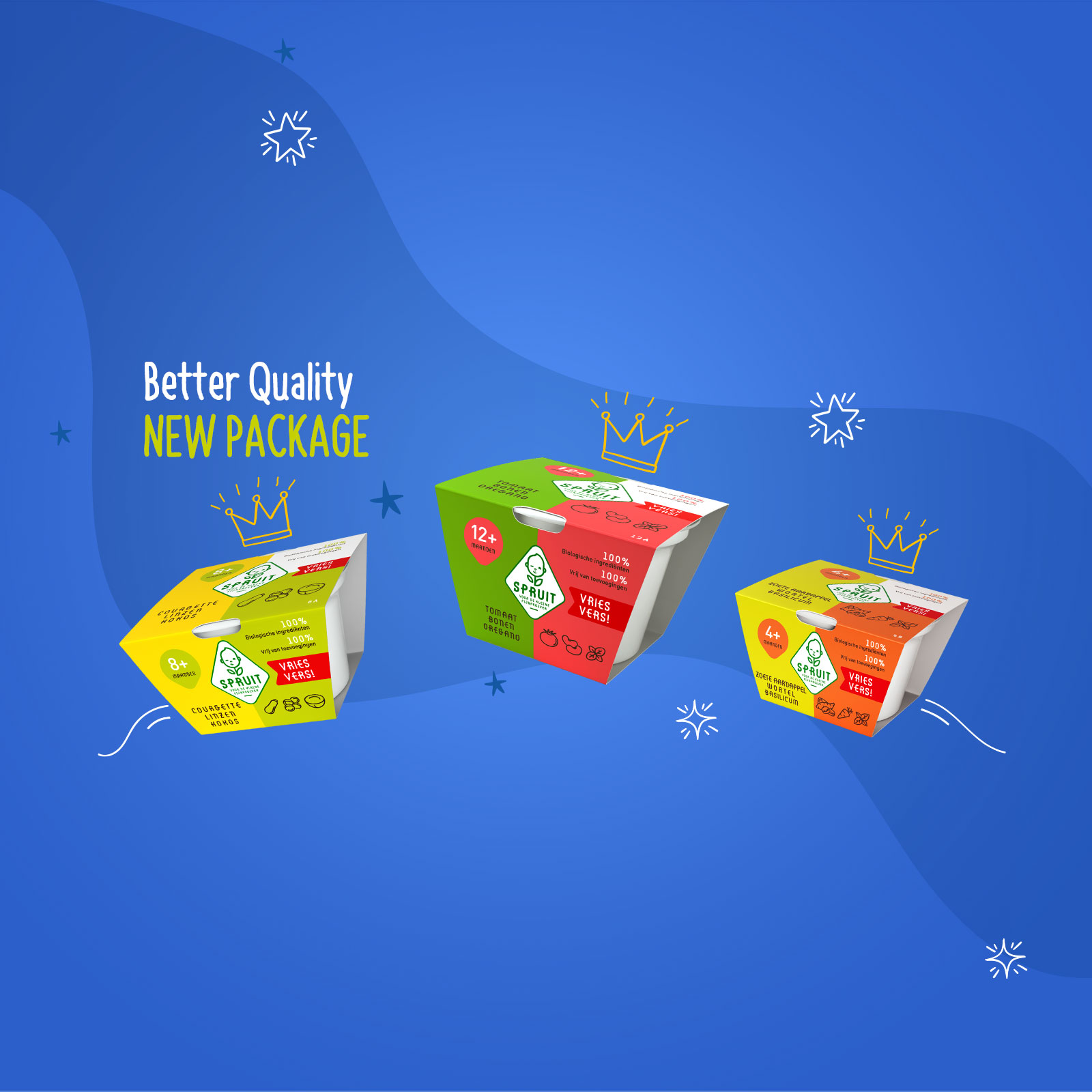
“Fresh” redesign of the Dutch products, Spruit
With respect to the brand’s identity and main goal of maintaining and ensuring quality, we proceeded with a total redesign of the packaging of the well-known Dutch baby food company Spruit.
Designed for easy use and temperature protection, the new packages stand out for their special aesthetics, since the product labels used contain strong color options, able to arouse the interest of consumers. At the same time, their innovative shape and ideal size fully meet the needs of children and parents.
The new packaging has already been launched in the Dutch market with digital campaigns specially designed for the needs of the brand on Google and Meta. Another milestone in our collaboration with Spruit, which has led to an increase in orders, with the Dutch public already showing their preference for the brand.